The LearnDash Quiz Question Analysis report is a front end report for Administrator and Group Leader roles that allows easy review of selections for multiple choice questions. To use the report, add this shortcode to a page in WordPress:
[uo_question_report]
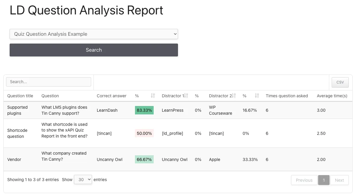
When viewed by a user, the report looks like the screenshot below.
This is a very powerful report for analyzing question quality and performance, but there are several things users should keep in mind when using the report:
- Administrators can see results for all quizzes and users. Group Leaders see quizzes associated with courses in their groups and for users in their groups only.
- Records are output for LearnDash “single choice” (a.k.a. multiple choice) question types only. The report will also only work when there are 2 to 5 possible answers to a question. If there are fewer than 5 answers for all questions, fewer columns will be output.
- Percentages are colour coded to make it easy to review results at a glance. If a correct answer has a percentage of students answers in the 90-100% range, it will be solid green. If it’s 0-10% (suggesting the question is too hard because few people choose the correct answer), it’s dark red. The shade of green or red varies for percentages between the extremes, and for distractors, the colours are reversed.
- The average time to answer each question is output in seconds.
- HTML (this includes images) is stripped from the “Question” column. This is done primarily to make sure there are no significantly layout issues in the report.
Because the report can include a lot of columns if there are several distractors for questions, sites may fine it useful to extend the report beyond the normal page body area. If that would be useful to your site, you can use the following CSS as a model for making the report wider than the page normally allows:
/**
 * Tin Canny - [uotc-group-report]
 * Creates a full-width report
 */
#uotc-group-report .uotc-question-report__table {
	position: relative;
}
#uotc-question-report_wrapper {
	width: calc(100vw - 60px);
	transform: translateX(-50%);
	left: 50%;
	background: #fff;
}
Hi Ryan, this looks great! Any reason it’s not available in the backend as well?
Thanks Mike!
Control over layout was one consideration. We support unlimited distractor columns and that’s a lot harder to do in /wp-admin/. We also thought it most closely aligned with the quiz reports we have in Tin Canny, which are also front end only.
Of course, it’s a first release, so we’re open to feedback and if we see a lot of demand for back end support, we may reassess where it’s offered.
Also, thinking about this a bit more, I’d love this to be available as a tab in the front end reports generated by [tincanny]. It’s a massively useful admin tool, but also useful for group leaders to know where their people are doing well / going wrong.
The current approach on small screns is to use the (+) symbol to expand out distractor columns, so it just expands to be as long as necessary. Seems this approach would make it would fit in the [tincanny] report 🙂
Love your work, team, this is exactly something I felt was missing!
Yes, we still don’t like the wrapping with the +; that’s why we included a CSS override above for large desktops. And at least there’s no problem when exported.
And yes, this could be added to the [tincan] output; we’ll give that one some thought!